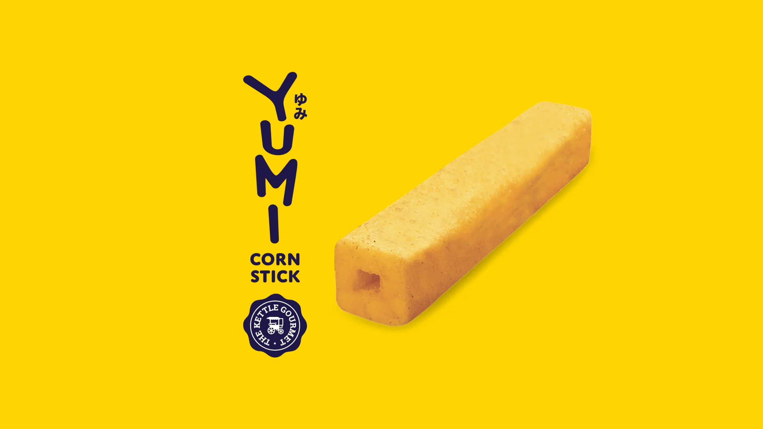
When The Kettle Gourmet approached Leap to develop branding for their new snack line, the brief was deceptively simple: make it fun, make it memorable, make it sell. What followed was a deeper exploration into character, culture, and the art of shelf appeal.
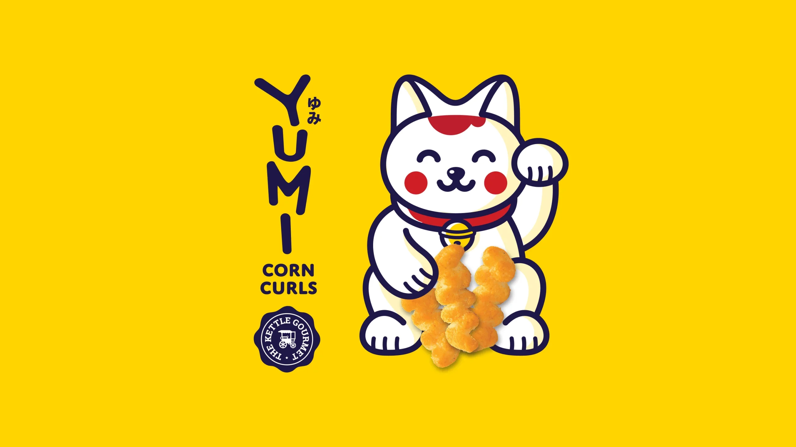
YUMI Corn Curls was built around a central insight — that great snack branding is as much about personality as it is about product. The maneki-neko mascot became the brand’s anchor, its cheerful demeanour and raised paw embodying the spirit of good fortune and irresistible snacking in equal measure.
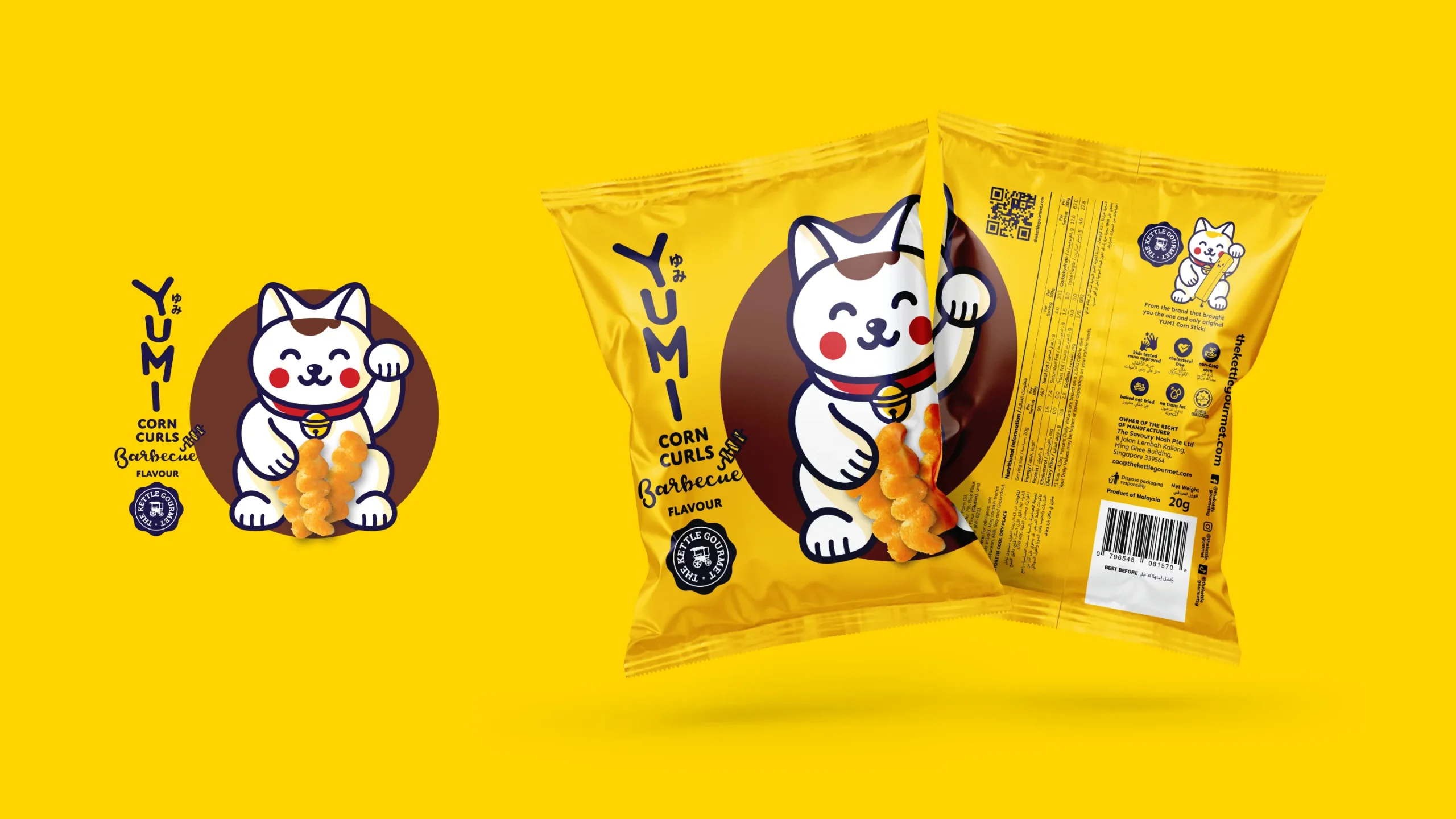
The design system was developed to be flexible yet consistent. Each of the three flavours — Cheese, Barbecue, and Squid — carries a distinct colour palette within a cohesive visual framework, ensuring strong individual identity without losing brand unity. Typography, iconography, and the Kettle Gourmet seal work together to balance playfulness with credibility.
The final packaging range is bold, shelf-confident, and unmistakably YUMI.