Some briefs arrive as products. This one arrived as a personality waiting to be born.
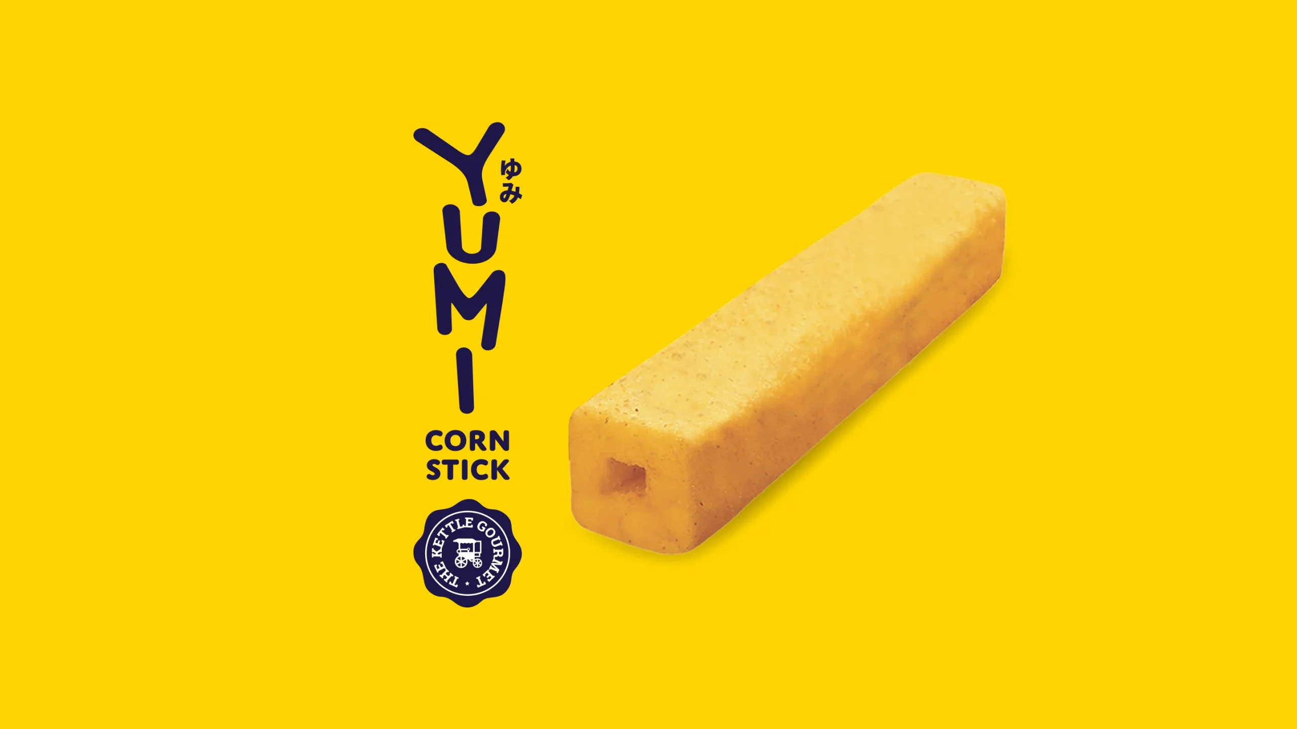
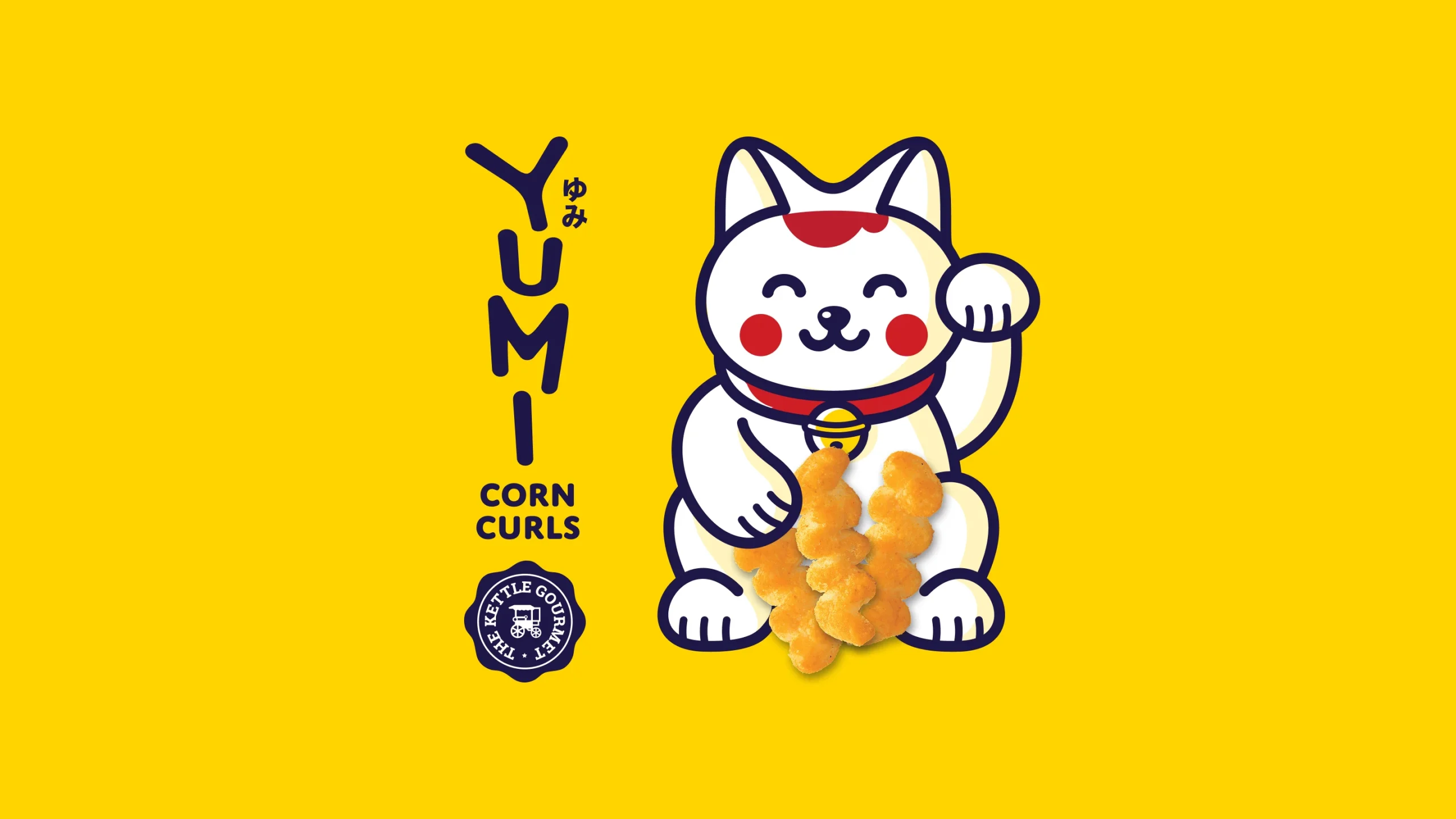
YUMI Corn Stick needed more than packaging — it needed a world. A name of Japanese origin conceived as a character representing life’s simple pleasures. That single idea became the foundation for everything that followed.
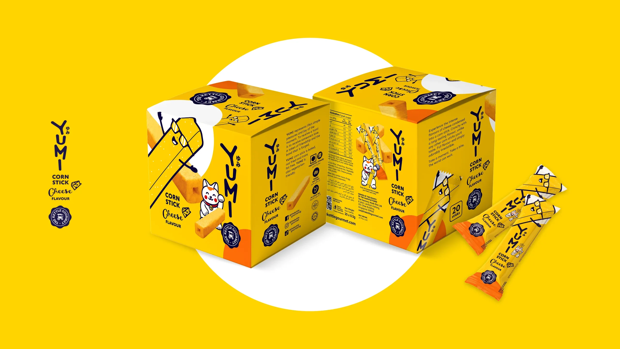
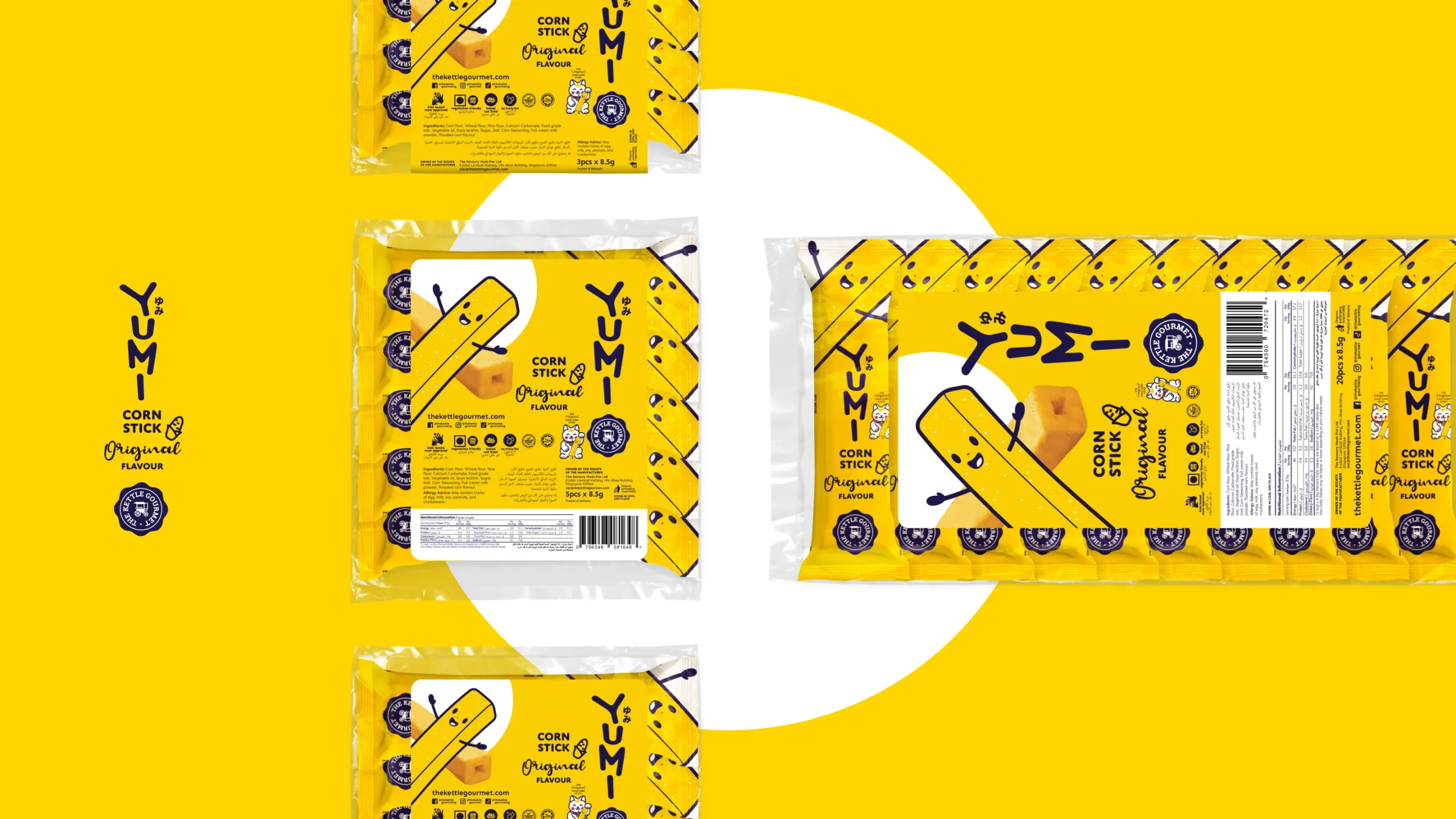
From the distinctive stacked wordmark and hiragana script, to three quirky flavour characters — Ori San, Cheesy San, and Chicky San — the brand was designed to feel warm, playful, and memorable from the first encounter. Flavour variants were differentiated through colour-coded packaging, each telling its own story while remaining unmistakably YUMI.
Across individual stick wrappers, polybags, boxes of 20, and a full retail floor stand, the brand language held with consistency and charm. Every touchpoint, right down to the haiku verses on each pack, was crafted to connect — not just inform.
A snack brand built on friendship. A brand world built with purpose.